
REED
Designing a reading experience that supports parents during storytime without turning a healthy habit into a score.
- Roles
- Product Designer
- Timeline
- June 2024 – Present
The brief
I was one of two of REED’s founding product designers.
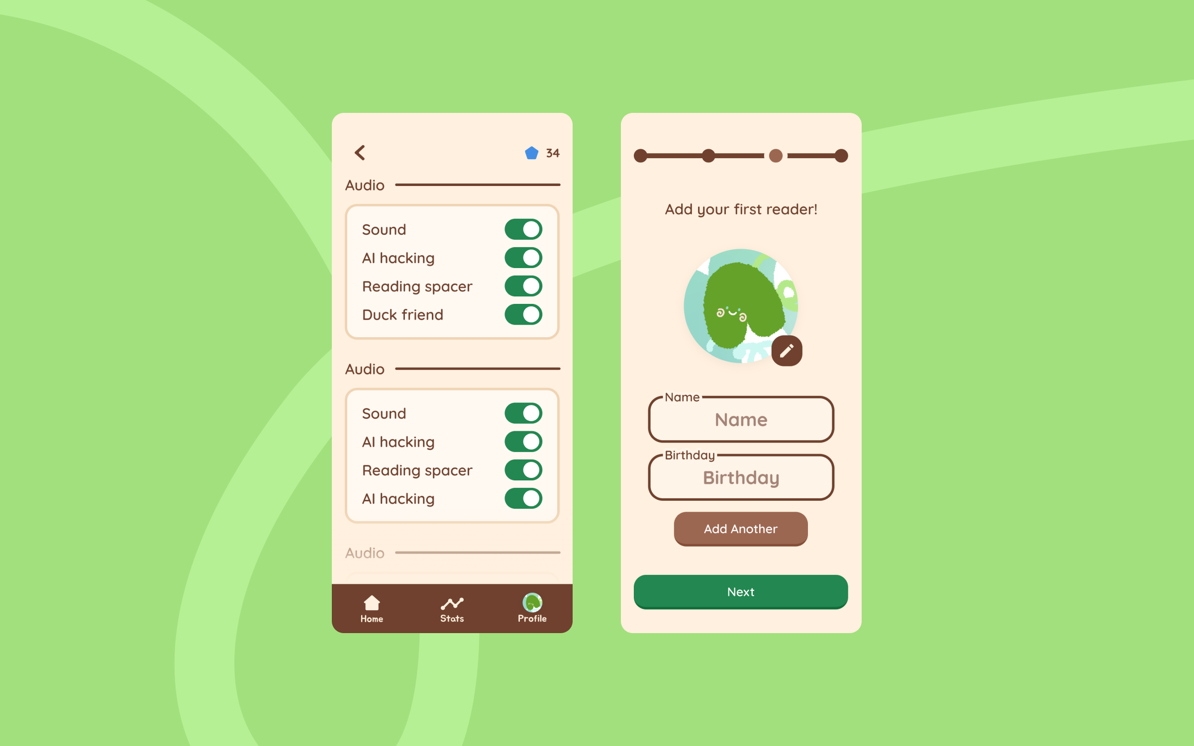
REED is a children’s app designed to listen to parent-child storybook interactions and enhance the process so that children are left with a strong reading foundation ahead of entering school.
I designed the core app flow, digital marketing materials, and supported grant fundraising while also conducting IRB-approved research to support academic writing and assess REED’s market value.
Design decisions
Ask at the right moment
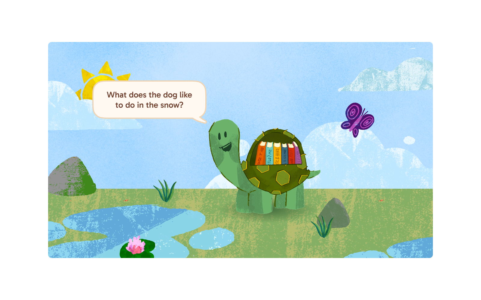
A big part of REED’s mission is to not replace the parent-child reading relationship, but rather enhance it. I did intensive research with parents to understand when a question would support storytime and when it would interrupt it.
I contemplated the amount of questions to generate, how many questions should show up during storytime, if a noise or vibration should play, how parents would prop up their phones while reading beside it…
Nudge without the guilt
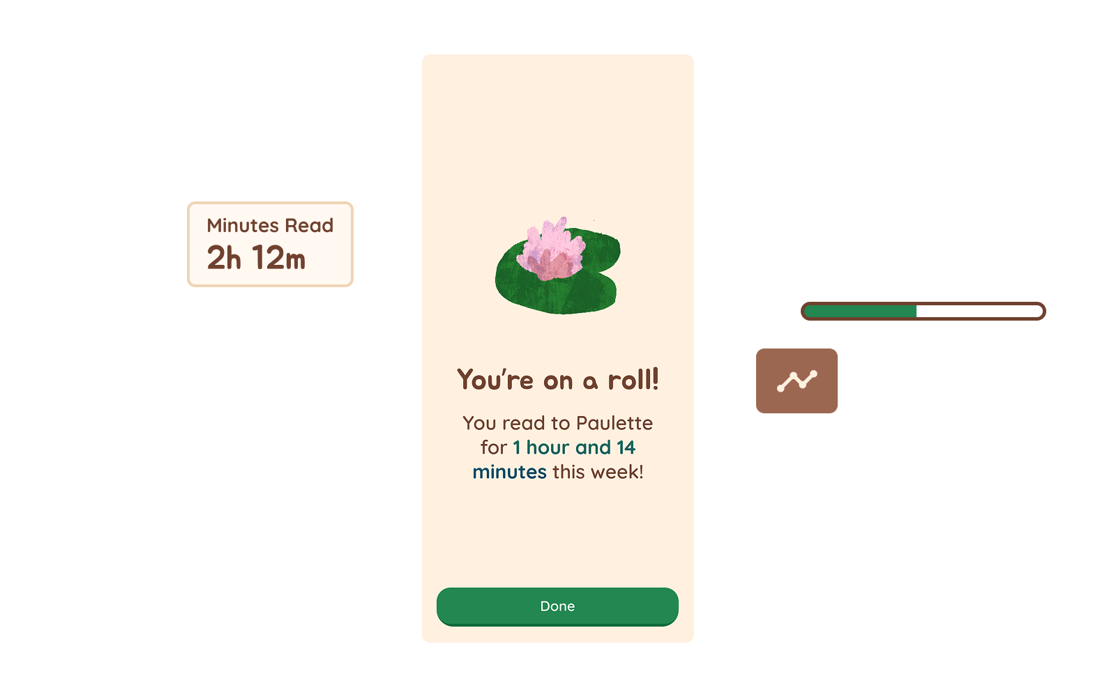
I chose not to use streaks. A missed day should not make a parent feel as though they have failed. The experience was designed to uplift parents and support healthy reading habits without relying on guilt as a motivator.
Instead, REED nudges by celebrating what a family has already done. A weekly recap tells parents how much time they spent reading together, like “You read to Paulette for 1 hour and 14 minutes this week!” Minutes read and a progress bar show the habit growing, with no streak to break or count to reset when life gets busy.
Establishing a design system
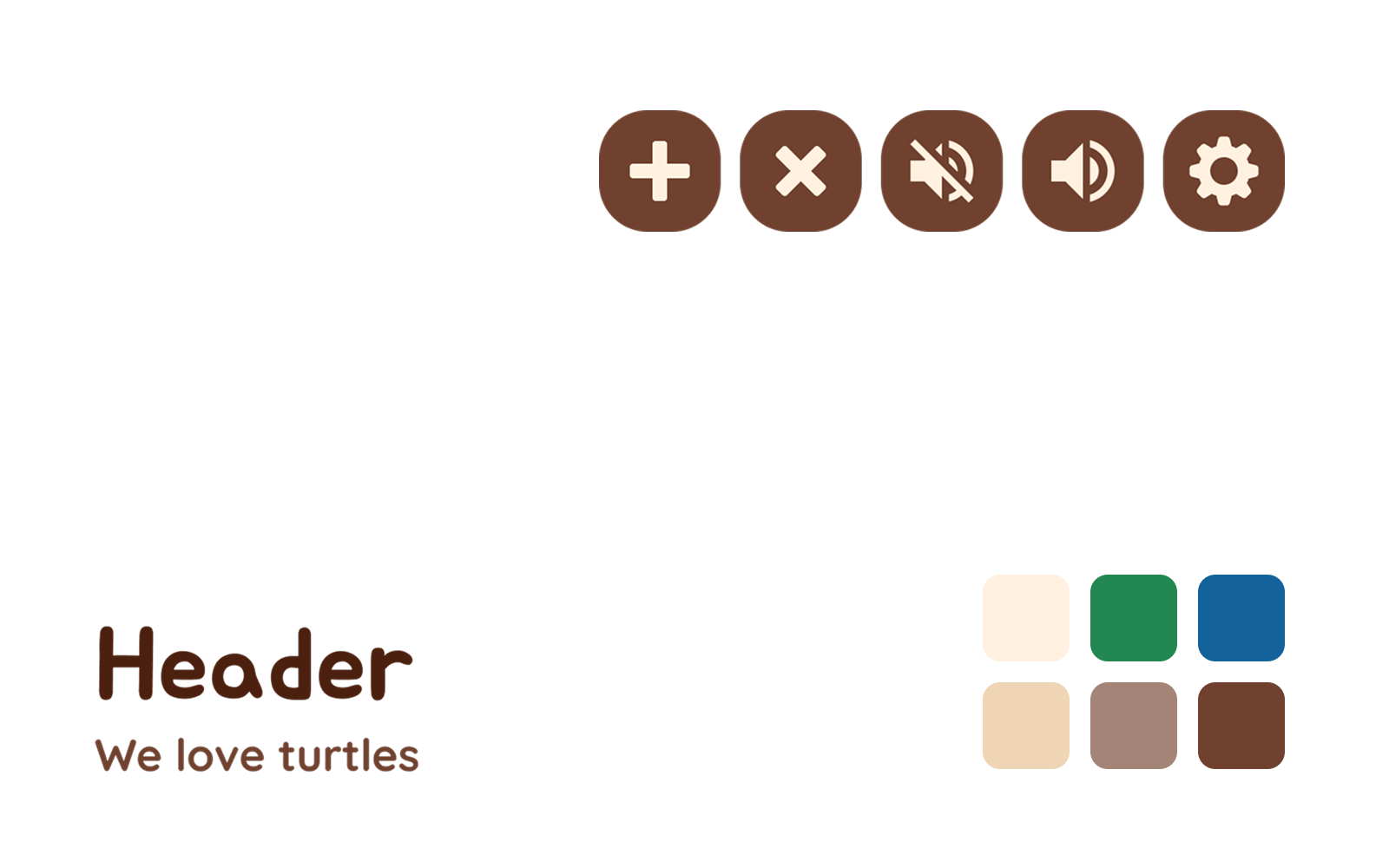
I built a small design system so every screen felt calm and familiar, for parents and kids alike. Soft, rounded shapes and type keep things friendly, and a warm palette of cream, green, blue, sand, taupe and brown carries the storybook meadow into the interface. The same rounded brown icon buttons handle every control, from adding a reader to muting sound, so parents only have to learn them once.
Impact
With the current designs, parents asked more questions and had longer conversations with their child. Parents asked 88% of the questions the app suggests, with 91% of those questions leading to back-and-forth conversation. This effectively allows parents to use research-proven methods to assist with their child’s reading comprehension and prepare them better for schooling.
Lessons
Share ideas early
On REED, I learned to show my co-designer work before I had a solution. When I got stuck, they often saw an approach I’d missed, and we built on it together.
The world of start-ups
REED taught me to take initiative in ambiguity. Throughout the product’s formation, I wore many hats across marketing, research, and product design.